S01E01 - LAURYL ZENOBI | PRINCIPLE UX RESEARCHER

For the first episode of the UX Pursuit podcast I’m thrilled to air my conversation with Lauryl Zenobi; Anthropologist turned UX Researcher! Like me she learned about UX research and was hooked. She worked hard to transition into user research and after successfully making that transition she literally wrote the book on how to become a researcher.

Whether you’re an aspiring researcher, a designer, a UX writer, or in product management I think you’ll enjoy our conversation and Lauryl’s book.

Listen Here or on your preferred podcast app.

You can find UX Pursuit wherever you listen to podcasts. Please subscribe so you’re alerted when new episodes come out and if you know others pursuing a career in UX, please tell them about the show.

Don’t forget that at the end of the first season I’m planning a panel discussion to answer your UX career questions. So, if you have questions please email me at hello@uxpursuit.com and we’ll do our best to cover them in the final episode of the season.

Thanks for listening!

INTRODUCING THE UX PURSUIT PODCAST

Six years ago I began my journey and I’ve been sharing bits and pieces of my own experience here on the site but recently I decided I wanted to do more than share just my story.

So, I reached out to a variety of UX practitioners to hear about their unique UX journeys and created this podcast. My hope is that, by sharing their stories, I might help and inspire those currently in their own pursuit of a UX career.


Join me over the next 15 weeks as I chat with designers, researchers, program managers, and everything in between about how they got to where they are today, what hurdles they overcame, and what advice they have for those currently pursuing UX. 

Episode 1 goes live on Wednesday, April 14th!

Season 1 Guests:

1. Lauryl Zenobi

2. Megan Greco

3. Jake Lunde

4. Dave Kennedy

5. Savannah Ostrowski

6. Leili Slutz

7. Tulsi Desai

8. Josh Klekamp

9. Brandon Sapp

10. Julie Riederer

11. Alanté Fields

12. Todd Bennings

13. Emma Bulajewski

14. Dylan Moss

15. Panel episode where we discuss your UX career questions.

You can find UX Pursuit wherever you listen to podcasts. Subscribe now and if you know others pursuing a career in UX, please tell them about the show. 

If you have questions about the podcast or questions about pursuing a career in UX or if you are interested in being on future seasons of the show please email me at hello@uxpursuit.com.

Thanks to Irene Barber, a fellow UXer, for creating the music you will hear on the podcast. Be sure to check out her music under the artist name Nearby on Spotify or at nearbymusic.bandcamp.com.

Learn more about the podcast here.

Thanks so much for listening and don’t forget to share the show with folks you think would enjoy it!

WHAT’S IT LIKE TO BE A UX RESEARCHER WORKING AT A UX CONSULTANCY?

Recently I was asked to participate in a video podcast that sought to answer that very question. 

Ethel Xu, along with fellow Master’s students Honson Ling, and Patriya Wiesmann, hosts a video podcast series with the purpose of having “UX industry professionals to share their journeys, experiences, and practical insights with students and juniors UXers looking for growth and knowledge in UX.” I had the pleasure and honor of being a guest on their episode focused on working in a design consultancy. I, along with Andrea Kang, a Senior Interaction Designer at Artefact, and Shimiao Wang, a recent UX Design Intern at Blink, shared our thoughts on what it’s like to work at a UX consultancy. 

The key elements of my experience working at a consultancy have been work flexibility and variety, building deep client relationships, and working alongside amazing and talented people.

Watch the video here to hear what Andrea, Shimiao, and I have to say. 

MORE DO'S AND DON’TS OF DIARY STUDIES

Almost two years ago, after seven months of repeating diary studies, I shared my Do’s and Don’ts of Diary Studies. After taking the lead on two more diary studies at the beginning of 2020 I’d like to add a few more tips to help ensure your diary studies are as effective as they can be.

Before I get into the additional do’s and don’ts let me give you a little context around the diary studies. Both studies were in support of the launch of a new fitness device and its companion mobile app. While my focus was on the companion app my colleagues led the first of what would be two rounds dedicated to the hardware device. After some time to address the issues and findings of the first round I led a second diary study concentrating only on the hardware device. The goal of all three of these diary studies was to assess the readiness of the device and app before the product’s launch. We wanted to understand the overall user experience of customers; from initial education of the device, through the purchase, delivery, and setup processes, and concluded after one month of using the device and app. Additionally, we sought to not only evaluate the usability of the app, but also to gather feedback related to the features and content users experienced while using both the app and the device. In short, there was a lot to study!

Illustration of a key finding from my companion app diary study. Created by Paige Doolin.

Illustration of a key finding from my companion app diary study. Created by Paige Doolin.

Using our team’s previous experience and knowledge around diary studies we were able to deliver three very insightful and impactful studies which helped the client confidently launch their product. In fact, at the end of our research, the company’s COO stated, "I want you to know the IMPACT of all of your work, because it's really important. Based on this research, we have decided to release the device to market. This gave us the confidence to do that, and we already have X deposits and Y devices in homes today." (The exact numbers need to remain confidential.)

do01.png

Supplement the study with observational (or qualitative) interviews - Diary studies do a great job of gathering quantitative and qualitative data over time (great for assessing attitudes and behaviors) but because this data is self reported by participants and it often doesn’t tell you the complete picture. For the companion app study I designated two small groups that would participate in observational or qualitative interviews in addition to the diary tasks they completed throughout the study. For the first group, I observed them going through the initial onboarding and first exploration process. For the second group, I interviewed them half-way through the study to have them walk me through how they use the app and asked specific questions around their use of key features. These sessions revealed several critical difficulties around the onboarding process as well as discoverability issues for numerous features. Without these sessions we most likely would not have identified these problems because it is not possible for participants to report that they cannot find a feature they do not know exists.

Repeat the study after fixes have been made - Repeating research can further validate findings from previous research but it also uncovers the issues or pain points left undiscovered from the first round(s) of research. The key to that second point is taking time between studies to fix the issues first discovered. By making these fixes, the next set of research participants will help you identify other remaining problems or pain points because they were not tripped up by those that have been fixed (something I discussed in a previous post). This benefit was realized when we repeated our diary study focused on the hardware device after the client had addressed many of the insights and findings we learned in the first round. In the first round participants were unclear on many of the onboarding steps because they could not be accessed via the device's display. Participants in the second round saw these steps on the display and smoothly sailed through the onboarding process. Because participants were able to quickly and easily set up and start using their device, this gave them an opportunity to discover that the content was not organized as they would have preferred; a finding that was not uncovered in the first round perhaps because participants were just happy to have finally concluded their struggle of the onboarding process. While not all issues can be addressed between rounds of research, repeating the study can help validate those found in the previous round(s) which further drives home the need to correct those earlier discovered problems.

don't02.png

Ask too many questions - Yes I mentioned this in my first post but I think it’s worth mentioning again but this time it’s on behalf of the researcher. Make sure you consider the number of questions you ask as well as the number of tasks participants perform. It’s up to you to look through all these data points and report out your findings. For my diary study focused on the companion app I had numerous stakeholders that each had numerous research questions and all were of equal importance, according to the client. I quickly learned that I was a little overzealous in my attempt to try to accommodate all their needs. While I feel I was able to deliver on the core questions they had I know there was still unexamined data that held more insights but time constraints kept me from analyzing all that I was collecting. So, take time to prioritize what’s most important and leave the less critical questions for the second or third round of research.

Wait to report findings until the end - Even after refining our study protocol to use the most critical questions for the second round of our device study, we still had an enormous amount of data coming in because we had approximately 75 participants spread across three US cities. To help tackle this large amount of data and to keep the client informed of what we were learning I delivered weekly topline reports which focused on key steps in the overall customer experience process (remember our study started at the initial education of the device, through the purchase, delivery, and setup processes, and concluded after one month of using the device). This proved to be a great way to divide the data into logical and manageable chunks and allowed us to report our issues and findings quickly and directly to the key stakeholders focused on specific steps in the customer journey. Because we delivered on this weekly routine the client could quickly begin implementing fixes and changes aimed at improving the overall user experience. Additionally, this weekly rhythm gave us great insight into how numerous metrics were tracking week after week. In fact we saw steady improvement for nearly all key metrics, including participant satisfaction, during the second round of our device diary study.

Much like the previous ‘Do’s and Don’ts’ I shared, these came from my desire to conduct effective and impactful research studies. Hopefully you can utilize them in your next diary study. And, as every study is different, you’ll likely discover other ways to run more effective and insightful research.

⬡ ⬡ ⬡

Do you have experience running diary studies? Please share your ‘Do’s and Don’ts’ by leaving a comment below. Thanks!

CURIOSITY: A CORE VALUE

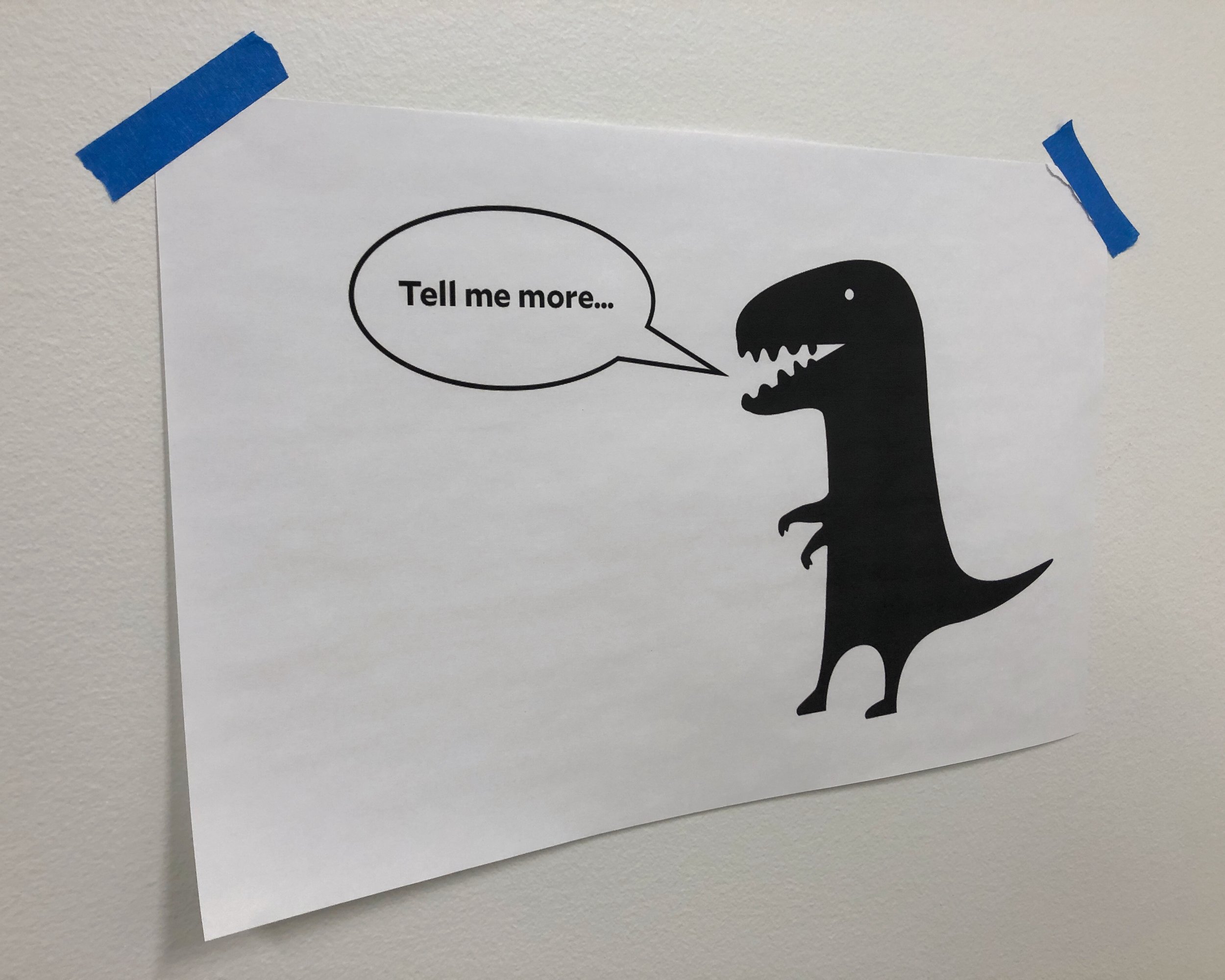
“Tell me more…” One of my UX research mentors is the master of this phrase. I observed numerous sessions where these three simple words were expertly used to seek more from a research participant. His goal was to gain a better understanding of whatever the participant had just said and ultimately, uncover the answers to the research questions he was tasked with finding.

This act of digging deeper to uncover more or learn is one of my favorite parts of research. It is also another core value of my UX career; CURIOSITY.

curiosity.png

Last week I connected with a college student who recently began her own pursuit of a UX career. She reached to me “to get a more authentic understanding of this field,” and for some advice on seeking a design or research internship.

One question she asked reminded me of the importance of curiosity in UX research. “What have you found to be the most crucial questions to ask participants in usability testing, and have any results been surprising? (In that maybe some participants have experienced/noticed something that the designers/researchers didn't think the same way about.)”

Here’s how I answered her questions:

The questions asked during testing are so dependent on the product, project goals, and research questions that there is no one or two crucial questions that should be asked. That said, this is one crucial thing you should do in all your research sessions: when something a participant says (or does) that seems interesting or is somewhat unclear, say, "Tell me more." UX research is about finding the "why." You might ask a participant, "On a scale from 1 to 7, how easy or difficult was it to find the information you wanted? (Where 1 is very difficult and 7 is very easy.)" but if you don't ask them "why" you're only getting half the answer.

For me, the “why” is what drew me to research and I love getting to learn more about people's understanding, expectations, habits, thoughts, actions, interpretations, frustrations, ideas, etc. Knowing this enables informed design decisions, resulting in products and services that better serve their users.

In addition to understanding the "why," research should uncover those things that end users experience or notice that the designer or researcher didn't anticipate. The designer isn't always going to be a power-user of a product or they may not use it the same way as others. (This is where observation and empathy are crucial.) Research helps to guide initial designs and should be used again and again in an iterative process to point out issues and opportunities which can help create the best products possible.


During research sessions there are often many moving parts, lots to track, and key questions to cover so, in midst of balancing all that, it never hurts to have friendly reminder of staying curious. In our remote research labs (labs dedicated to sessions with remote participants) I’ve placed this inspirational “artwork” to help keep “Tell me more…” top of mind.

A friendly reminder…

A friendly reminder…

NO UX LAB? NO PROBLEM!

-or-

Overcoming common obstacles preventing UX Research

In the last few years I’ve had several people come to me seeking advice about setting up easy-to-use, inexpensive, and effective usability testing kits. This includes an Amazon Research Team, a Facebook Research Manager, and a Principal User Experience Designer at REI. Why are these and others reaching out to me? Because they understand that research is vital to the success of their products and they don’t want technology, time, or money to prevent them from doing research.

These requests got me thinking about some common obstacles that prevent UX research from happening and what can be done to overcome them. Guided by the wisdom of one of the UX forefathers, Steve Krug, other seasoned UXers, and my experiences in UX tech and research I’d like to share three truths to show that you can overcome these obstacles and ensure UX research is not overlooked or dismissed.

You can easily create your own inexpensive and effective “UX Lab.”

Obstacle #1: Equipment is expensive and/or complicated.

During my time at Blink assisting with the technology side of UX research I was tasked with supporting numerous projects with needs beyond simple usability testing of a website. ‘Wizard of Oz’ testing of a smart kitchen appliance, testing of a app connected to a newly-designed gas-pump interface, testing the in-run experience of a redesigned running app, testing several iterations of components connected to the U by Moen smart shower, and a two-week diary study of a voice-activated speaker in participants’ homes are just a few of the more unique setups I’ve designed creative solutions for. While these projects have unique technical challenges, the majority of projects I’ve supported or led as a UX researcher are much simpler. The technical essentials are usually capturing a computer or phone screen, the participant’s face, and of course, audio from both the participant and the moderator.

I’ve utilized and I recommend two techniques for effectively capturing research sessions. With a few pieces of equipment and some training anyone can put these to use.

Technique 1 - Utilize Web Conferencing Software

Web conferencing software options are abundant and many of them are free or inexpensive. The tool that I recommend and have had great success with over the years is Zoom.

Utilizing Zoom to run remote moderated usability testing.

Utilizing Zoom to run remote moderated usability testing.

Zoom is designed to effectively capture whatever is needed during your research session. Zoom will automatically capture the participant’s face and audio and give you options for sharing either the participant's desktop or even mobile device. Additionally, the moderator is able to share their screen and give the participant control of the mouse. This is very effective when testing an HTML prototype or new designs you don’t want participants to have access to after the research session. Zoom also has the ability to automatically or manually record the meeting to your computer or in the cloud so, at the conclusion of your session, you have a PiP-configured MP4 file ready to be shared out or cut it highlight reels.

Getting stakeholders to watch sessions couldn’t be easier; just send them the Zoom meeting link and they can view from anywhere. The only downside is that there is the potential for your participant to feel like 10 people are watching them, especially if people are coming in and out of the meeting during the session. One way to limit this is to make an easy ‘Zoom Lab + Observation Room.’ Just do the following: the participant uses one computer in the 'lab' and one observer joins the meeting (muted w/ no video) and connects their computer to a large monitor, giving you a simple but effective 'observation room.'

Zoom’s many features, including all their screen sharing options make it a great, off-the-shelf research tool and the free version may be all you need.

Technique 2 - Stream Your Sessions to YouTube

If you’re feeling a bit more tech savvy and want more video/capture options then utilizing the free video production software OBS in conjunction with YouTube is another great way to capture and share research sessions.

Field kit for usability testing of a mobile app. Photo by Greg Hansen.

This technique takes advantage of free software as well as a free and very accessible location for live viewing and storing sessions. OBS is a free and open-source software designed for video recording and live streaming. For UX Research only the most basic features are needed but if you do have a study that has unique requirements it should be able to accommodate them.

OBS has designed live streaming to YouTube built right in and there are numerous resources out there to learn how to properly set everything up. Viewing sessions on YouTube is easy and secure; just ensure your live streams are 'Unlisted' so only those with the proper link have access, not matter where they are. This eliminates the 'many meeting participants' problem discussed earlier. The downsides to this technique are that there is more setup between sessions, some basic knowledge of setting things up in OBS (but I don't believe it's too complicated), and an investment in dedicated equipment.

For more specifics regarding building out your own adaptable and capable UX lab see my recommendations list.

You can find the ‘right’ participants provided you take an iterative approach.

Obstacle #2: Participants are hard to find and/or expensive.

In his book, Don’t Make Me Think, Steve Krug lays out several true things he knows about testing:

  • “Testing one user is 100 percent better than testing none.”

  • “Testing one user early in the project is better than testing 50 near the end.”

  • “The importance of recruiting representative users is overrated.”

  • “Testing is an iterative process.”

Some common perceptions around research or testing are that many participants are needed and that you have to find the exact right people to test with. This tends to make research into more of a high-stakes process when it doesn’t need to be. Krug’s philosophy is that testing should be early and often.

He believes that it’s good test with people similar to those who will use your product or service but more weight should be put on making testing an iterative process. The following diagram illustrates how testing twice with three participants in each test will identify more problems then doing just one test with eight participants. The key difference is that the problems identified during the first test are fixed before the second test.

Jakob Nielsen, of the Nielsen Norman Group, reiterates this philosophy in his article, “Why You Only Need to Test with 5 Users. Through years of research and some sophisticated math, Nielson and another researcher found that five participants will provide approximately 85% of the insights your study will uncover. After the fifth participant, “you are wasting your time by observing the same findings repeatedly but not learning much new.”

When you follow the iterative testing process Krug and Nielson lay out research doesn’t need to be a high-budget, high-stakes thing. Multiple tests with a smaller number of participants will help make research a routine part of your design and development process and identify more insights for the same or even less cost.

With the right tools and equipment (discussed earlier), research costs should be lower and studies can be done anywhere; in your ‘Zoom Lab + Observation Room,’ with remote participants, or out in the field.

The iterative approach evangelized by Krug and Nielson should also reduce the anxiety of finding the ‘right’ research participants. Because testing is happening more frequently there should be less pressure compared to finding the perfect fifteen participants for a ‘big, all-or-nothing research study.’

When it comes to finding people to participate there are numerous creative ways to find them as well as industry tools specifically designed to supply you with research participants. I’ve had great success with Dscout, UserTesting, and Respondent, which are just some of the tools you can utilize.

With some creativity and persistence you can build a culture of informed decision making.

Obstacle #3: There isn’t enough time for research.

This may be the hardest obstacle to overcome and the one that doesn’t have clearly defined solutions. Creating a culture where research is prioritized is hard work but it can be done. I was fortunate to work on a team at Microsoft where design and development wanted to make decisions informed by research before too much time was devoted to design efforts or before elements went live.

Each organization is going to differ on how much they prioritize research and the techniques used to create more buy-in will differ from situation to situation but there are some tried-and-true methods worth noting.

Get People to Watch Research Sessions

While there may be some truth in the obstacle of time, I don’t believe people are lacking interest. So it is crucial you give them an opportunity to watch research happening. I’ve heard of and seen several tactics practiced that are effective.

Invite all your stakeholders to the research sessions. Set up calendar invites, make posters, send out all-company emails, personally invite them; just get them in the room. Steve Krug believes, “try to get [them] to at least drop by; they’ll often become fascinated and stay longer than they planned.”

Set up live viewings in common areas. Alaska Airlines broadcasted research sessions in one of their cafes and found it a great way to evangelize research efforts happening on their website and mobile app.  

Make viewing interactive—this will keep observers engaged and can even help with analysis. Provide an observation worksheet or something like the Rainbow Spreadsheet to fill out or have them jot down observations related to key questions on sticky notes—perfect for affinity diagramming later. Their insights are valuable and can help with analysis and recommendations.

Again, with the right tools and equipment, your stakeholders and observers can watch live UX research via Zoom or even YouTube.

Once they’ve had the opportunity to observe participants experiencing frustration with an account verification code thought to be working perfectly or the joy of successfully using a voice command to activate an IOT device you’ll have them hooked.

Create Compelling/Interesting Research Deliverables

Research reports are often stereotyped as dry and boring but there’s no reason they have to be. The insights and findings uncovered in research can have profound impacts so do what you can to make engaging, interesting, and empathy-inducing deliverables.

I’m particularly fond of highlight reels. They are quickly viewed, can be easily shared, and can have a huge impact on those watching them. For a multi-part study focused on DIY soap makers I created this highlight reel of participants sharing how soap making has impacted their lives. The stories shared in this video helped to build excitement around the design and research work we were doing.  

When it comes to effectively communicating your work don’t be afraid to build on the successes of others. There are numerous ways to learn from others who’ve gone before us. I’m fortunate to work with tremendous researchers and designers who are eager to share the lessons for creating compelling work they’ve learned along the way. Seek out UXers around you for advice and wisdom. I’m found that most are willing and excited to help others in the UX industry. I’ve also found the podcast Mixed Methods and their Slack group to be very helpful. Additionally, Medium is full of articles like this one, with great tips on how to ensure your research isn’t boring and people will read it.

Try Something New

When I was completing my User-Centered Design Graduate Certificate I had two instructors, Rebecca Destello and Justin Marx, who had previously worked together at a start-up where they developed a unique solution to their organization’s lack of research buy-in. The need to “quickly instill a culture of user validation,” as well as other needs, prompted them to develop a strategy they called “Witness Wednesdays” or “usability sprints.”

Rebecca and Justin define usability sprints as “a series of rapid-fire user studies, emphasizing team collaboration and organizational buy-in.” These sprints would take five days to run and were often executed as a four-week series. The basic outline for one week looked like this:

Monday

  • Researchers and designers collaborate on the week’s session guide and prototype.

  • Observers are reminded of their upcoming obligation on Wednesday.

Tuesday

  • Researcher finalize the session guide and ensure the lab/observation room are ready.

  • Designers make any necessary tweaks to ensure the prototype matches the session guide.

Wednesday

  • Researcher conducts five, one-hour sessions.

  • Observers record issues, quotes, ideas, surprises, etc. on sticky notes.

  • Team debriefs and does quick affinity diagramming after each session.

Thursday

  • Researchers, designers, and stakeholders discuss the results and ideate on top-line issues.

  • Researchers generate a brief email report of the findings for the whole organization (because everyone on the email was in the observation room, an email is all that is needed!).

Friday

  • Discussion and ideation continues, if necessary

  • Given time, researcher begin next week’s session guide, and designers begin iterations to the prototype.

While this system had its challenges it also produced numerous great results for their organization. According to Rebecca and Justin, the biggest outcome of “Witness Wednesdays” was that it broke “the stereotype that ‘research take too long!’” Check out their talk at Convey UX 2018 for more about the unique system they developed.

⬡ ⬡ ⬡

Pivotal to overcoming these obstacles and deploying these creative tactics is ensuring that your research can be observed. Whether it’s during a collaborative live-viewing or in a compelling highlight video it all starts with an effective UX lab. Don’t have a UX lab? That’s not a problem! You can see there are simple, elegant, and effective solutions out there ready to adapt to your needs and the creative solutions you develop to promote UX research.

For more specifics regarding building out your own adaptable and capable UX lab see my recommendations list.


What are the ways you’ve overcome these obstacle? Please share your UX tech tips, strategies, and creative solutions by leaving a comment below. Thanks!

EMBEDDED AT MICROSOFT

If you do a quick search on in-house vs. consultancy UX work you’ll find a slew of articles by UXers like this, this, or this sharing their thoughts and observations. And when I think back on my classes at UW there were many conversations discussing the merits and/or hazards of both types of work.

From what I’ve read and discussed at school and with other UXers, here are three brief considerations regarding working in both environments.

Variety vs. Singularity. At a consultancy you have the opportunity to work on a wide variety of projects while in-house you will most likely be dedicated to one specific product. In working on that one product you will get to see the impact of your work as you watch the product grow, develop, and hopefully come to fruition. In contrast, at a consultancy your work may or may not be implemented and you have very little control over this.

Slow Grid vs. Fast-Paced. In-house the work or progress made might be slow or drawn out due to numerous factors including business needs, legacy products, size of the company, etc. This, then can allow you the opportunity to make sure it’s designed and built based on informed research. At a consultancy the work can be fast-paced and you may feel the pressure of deadlines defined by the work contracted. Again, this can give you variety in your work – the opportunity to focus on one specific area of a product and then do something completely different on your next project.

Work-Life Balance. This one really depends on the company and the individual (more on this in a moment). I’ve read that in-house understands this balance better but I’ve also heard from others that they gained much better work-life balance after switching to consultancy work. At the same time I’ve heard from people who’ve left work-focused consultancies to go in-house where they found a much better balance.

A common qualifier that is a part of all these conversations and articles is that these statements are contingent on the organization and the person doing the work. Each are unique so in the end the choice to work in one environment over another ultimately comes down to the person and the place they’ll work.

embedded2.jpg

My UX experience up to this point has been entirely at a consultancy but I’ve just started on a two-month project where I’ll be embedded as a UX Researcher on a team at Microsoft. I’ll be developing and executing on a variety of research initiatives. I’m extremely excited to have the opportunity to work in-house for a few months; to experience the other side of the coin. This will be a tremendous opportunity for me to learn and grow as a UX Researcher and to also see what working at a large company, on a small team, focused on a few products is like.

⬡ ⬡ ⬡

What has been your experience working in-house or at a consultancy? Please share your thoughts by leaving a comment below. Thanks!