EDUCATION: CREATING A LOGO

UX Pursuit Logo

UX Pursuit Logo

For the next unit in my communications course our goal was to design a logo that illustrates and brands our topic, or in my case, this site. In setting out to create my logo I knew I wanted simple lines, minimal colors, and basic shapes. I also knew I wanted to try to express two main ideas.

The first is the idea of ‘finding my way’ or a sense of pursuit toward a user experience career. The second idea was to express a sense of the broad spectrum that is user experience. Lately, as I mentioned in a recent post,  in my pursuit of a UX career I’ve discovered UX involves more than just web/mobile design. It “encompasses all aspects of the end-user’s interaction with the company, its services, and its products”. Again, the spectrum graphic developed by Information Architects, Inc. does a great job of illustrating the wide scope of user experience and served as some inspiration for my logo.

Draft:

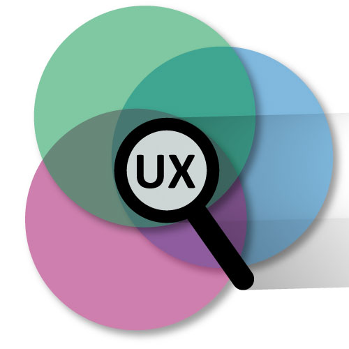
In my first draft, for the pursuit theme, I tried to find a symbol that meant searching and the symbol that made the most sense was a magnifying glass. Following the simple lines motif I created a simple magnifying glass. I didn’t want the object to be too literal. I wanted a simple outline or something similar to the figure/ground technique. To try to convey the overlapping and broad spectrum of user experience I played with overlapping circles and colors.

Combining the two I wanted to achieve a sense that the magnifying glass is finding UX among the many colors. This is the same sense that I was trying to convey in my graphic collage. To make the logo pop a bit I added the blend technique to the magnifying glass and gave the three circles a drop shadow effect. Additionally I played with rotating the the circles and magnifying glass about thirty degrees to give some visual interest.

First draft.

First draft.

After I completed my first draft I was pretty pleased with the design.

Feedback:

After reviewing feedback I received from my classmate and taking a second look at my logo a few things stood out that I knew I needed to address. The first was simplifying the logo. The shading effect I tried to create and the drop shadow on the circles needed to be removed. Additionally, I saw that the logo need more of an enclosed feel. The first draft felt like it could all just wash away.

Revisions and Tweaks:

The first step I took to refine the logo was enclosing my it inside a hexagon shape and removing the shading and shadows. I still felt like circles of colors seemed disjointed or floating. I attempted to add a 4th circle but still wasn’t happy with what I had. I kept coming back to the ‘spectrum of ux’ graphic and some of the enclosed colors stood out to me. I decided to divide up the hexagon shape into equal pie like slices and I colored them in with the colors that inspired me from the graphic. At this point it was clear that I was on the right track. One final tweak of shifting the center of the ‘pie shapes’ to the center of the magnifying glass and it was perfect. Lastly I added in the letters ‘UX’ inside the magnifying glass and my logo was done.

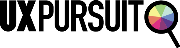
In creating my logo I was very happy to see the progress I had gone through to get the final result that I did. I enjoyed ideation process of creating, assessing, tweaking, and then repeating those steps as many times as necessary. Since I developed the main logo I’ve gone back I played around with an alternative letter logo that I can use in other ways. At first I copied the magnifying glass shape out of the main logo and tweaked it to replace the “P” in pursuit. Again, after I stepped back, assessed the design, and got great feedback from my wife I adjusted the my original idea (we realized the magnifying glass looked more like a “q” then a “p”).

Alternative letter logo.

Alternative letter logo.

Here’s a look at my process from start to finish.

I'd love to hear your feedback on the logos I made. Please let me know what you think. Thanks

USING DATA TO DRIVE CHANGE (ONE CYCLIST AT A TIME)

Last week I volunteered part of my day to the 2015 Bike/Pedestrian Count as a part of the Washington State Bicycle and Pedestrian Documentation Project. I chose to spend my time counting cyclists and pedestrians for two main reasons. Firstly, as a bike commuter, I want to see continued improvements made for non-traditional commuters in a city where congestion and traffic seems to be getting worse and worse. And secondly, I can get behind the approach in which WSDOT and the Cascade Bicycle Club are using to drive change: through the collection of data.

Sunrise at the intersection of the Duwamish Trail and the W. Seattle Bridge Trail.

Sunrise at the intersection of the Duwamish Trail and the W. Seattle Bridge Trail.

When I moved from Kansas City to Seattle just over two years ago it was clear to me that Seattle is a much more bike friendly town than Kansas City. This is partly due to the temperate climate of Seattle but, more importantly, it is due to political support and the work of organizations like the Cascade Bicycle Club to make Seattle a more 'bikeable' city through the Seattle Bicycle Master Plan. Commuting to work on my bicycle seemed like the obvious choice especially when my office provides bike storage and locker rooms. In 2014 I rode nearly 1120 miles on my bike and this year I’ve already surpassed that number.

When I learned that volunteers were needed to count cyclists as a part of the effort to make Seattle more 'bikeable' I knew I wanted to help. I was especially excited to learn more about why we would be counting commuters at key locations throughout the city. The Washington State Bicycle and Pedestrian Documentation Project is “an annual bicycle and pedestrian count taken at locations throughout Washington State in nearly 50 jurisdictions. Data collected from these counts will be used to monitor success in increasing bicycle and pedestrian travel as identified in the Washington State Bicycle Facilities and Pedestrian Walkways Plan while also providing critical data to support improvements to bicycle and pedestrian facilities.”

The key part of this project is that “counting bicyclists and pedestrians at specific locations will help us to more accurately estimate demand, measure the benefits of investments, and design our projects. This information will also help us target safety and mobility projects and improve our traffic models.”

I see the positive way in which data can drive good decision making everyday at the user experience firm where I work. Our goal is that the user research we do informs the designs we produce. I too feel that important decisions, including how to make Seattle more "bikeable", should be made with good supporting data. This concept, 'data-driven-decisions', is standing out as a key component to creating great user experiences. 

I hope the information I collected helps to make improvements for the fellow commuters in my neighborhood. So how are things looking?

Here are the numbers for the morning commute at the intersection where I counted since 2009:

2009 - 139 | 2010 - 123 | 2011 - 289 | 2012 - 258 | 2013 - 233 | 2014 - 315 | 2015 - 308

Cyclist counted at the intersection of the Duwamish Trail and the W. Seattle Bridge Trail from 2009 to 2015.

Cyclist counted at the intersection of the Duwamish Trail and the W. Seattle Bridge Trail from 2009 to 2015.

At least for my intersection, it looks like the numbers overall are trending up but I’ll leave it to the Washington State Bicycle and Pedestrian Documentation Project folks to really crunch the numbers.

Bike commuting back in May 2014. 

Bike commuting back in May 2014. 

#bikeseattle

EDUCATION: NARRATIVE GRAPHIC COLLAGE

As I mentioned in a previous post, this semester I’m taking a few classes to work toward completing my degree. One of the two courses I’m taking this semester is Multimedia Content Creation which centers around storytelling design principles as well as digital media design and production skills.

For our first project we dove into Photoshop and our goal was to create a narrative graphic collage. Mine would focus on telling the story of my UX pursuit.

I wanted to try to capture how I feel part of me is focusing on completing my schooling and the other part of me is always looking for ways to focus on UX training. To me, this idea closely follows the left brain and right brain analogy where the left brain is more regimented and the right is more creative.

Layered below the main R + L image and the icons are several photos. At the bottom is a photo a friend took (and gave me permission to use) of an art exhibit in Italy. It is numerous, numerous strings strung from floor to ceiling with keys attached throughout. Above that is an photo I captured of a colleague sketching out a timeline of one of his research projects on a frosted glass wall. Last, is an image I took of a rock climbing wall with numerous handholds. The wall also has a pattern running horizontally across it that resembles a topographical map. With all these base images I’m trying to evoke a journey feeling, one that sometimes looks like a complicated mess and one that sometimes looks more simple with clear steps (or handholds) along the way. Above the right brain I have placed icons and symbols that depict schooling and above the left brain I’ve showcased icons and symbols that encompass UX training.

The last part I included was the user experience summary the Nielsen Norman Group, a leader in user experience, follows.

– – – – –

UX icons (A, B, C, D, E, and F) and schooling icons (A, B, C, D, E, F, and G) used with permission. All other images used in collage that aren’t my copyrighted material have been used with permission. Click the appropriate links above to see image’s source.

THE BROADER DEFINITION OF USER EXPERIENCE

The Nielsen Norman Group, a leading voice in the user experience field, summarizes user experience in the following way: “‘User experience’ encompasses all aspects of the end-user's interaction with the company, its services, and its products.” They go on to elaborate this idea further by saying, “In order to achieve high-quality user experience in a company's offerings there must be a seamless merging of the services of multiple disciplines, including engineering, marketing, graphical and industrial design, and interface design.”

This graphic developed by Information Architects, Inc. does a great job of illustrating the wide spectrum of user experience.

Stepping back and looking at this broader definition of UX has been something I’ve been thinking about for a few months now. It began back in July when my wife, Beth, and a small team from her company, went to Los Angeles to do customer research (she works for a national outdoor retailer). The team was lead by Sarah, the Design Insights Manager, and their focus was to interview existing cycling customers to discover why and how they use the products they have purchased and to understand their attitudes toward the brand and the products they own. They visited customers in their homes and stopped by bike shops and collectives all to chat about bikes, gear, and the overall bike culture in LA.

When Beth returned home and recalled the many great conversations they had had I remember thinking what a great way to connect with your customers, learn more about how you can improve products, and hopefully strengthen the brand for that customer and future customers. She also told me that Sarah and her team have done similar “insights” trips focused on hiking customers. They hiked part of the Appalachian Trail and conducted interviews with hikers along the way. How cool is that?

I never even knew something like this existed! It makes sense that it would. It’s the followup you need to have with existing users to ensure that the experiences you’re creating keep improving. 

For me it’s encouraging to see this broader view of UX. Being a UX designer is proving to cast a wider net of possibilities than I originally thought.

EDUCATION: MULTIMEDIA CONTENT CREATION

I’ve officially kicked off my degree completion at Washington State University. Of the two courses I’m taking this semester I’m very excited about my communications course; Multimedia Content Creation. The course is designed to teach both storytelling design principles and the basic digital media design and production skills using the Adobe Creative Cloud applications – Photoshop, Illustrator, Audition, and Premiere. I have varying levels of experience with each of these programs but I’m excited to dig into each of them a bit more to create some specific and original content. 

For the semester our main focus will be storytelling and creating content around one main topic. It was a no-brainer to center my topic on my UX pursuit. For my this course all the work I create will be focused on my pursuit of a user experience career. I’m excited to produce more and different content that I can use to build a portfolio (here on this site) that not only shows my work but also the journey on which I have traveled.

First up, Photoshop. I’ll be posting the work I create for this first unit soon. But first, I'll leave you with a great video my professor shared celebrating the 25th anniversary of Photoshop launching. 


EVERYDAY UX: THE BENEFITS OF UNIVERSAL USER EXPERIENCES

Over the past five years I’ve supported users with their technology questions, either as an IT professional or “that techie friend,” and one constant that remains is the usefulness of a universal user experience. Maintaining a consistent design, feel, and set of interactions across devices is at the heart of universal user experience. Think of accessing your bank via an ATM, a website, and a mobile app. The more closer correlated the experiences are at each of these places the better. This is so important in today’s culture of multiple devices and the desire to seamlessly shift between those devices.

Among the many upsides of universal user experiences, I’d like to showcase two practical examples that demonstrate the following benefits: improved user efficiency and decreased learning time for users.

My first example? The implementation of the Apple external trackpad over the mouse.

In 2010 Apple introduced the Magic Trackpad by essentially pulling the multi-touch trackpad out of its notebooks and setting it next to your external keyboard. Like most, I initially didn’t see the advantage of this over the well-established mouse, but since more and more multi-touch gestures have been added to OS X, the scales have tipped toward the trackpad. Learning the many gestures, which are conveniently shown in the trackpad’s system preferences, enables a user to take full advantage of all the operating system’s features. But when that user goes to an external mouse he or she must learn an additional set of gestures (that in my opinion are cumbersome to do on the mouse compared to the trackpad). Using the external trackpad is a natural extension of what the user already knows therefore eliminating extra learning time or confusion.

Apple's Magic Trackpad gestures for Launchpad, Mission Control, and Show Desktop.

My second example is the use of the Gmail web app over many alternative mail apps. This really breaks down into two parts: the experience of email on a computer and, closely related, the experience across devices.

I’ve been a Gmail user for close to ten years and I’ve always accessed my email via the web. Over the years Google has made incremental enhancements to the web experience and this is one reason I feel it is an improvement to traditional mail apps. Instead of infrequent, new application launches with large sweeping changes that can take time to find and learn, Gmail is able to roll out its new features with much more regularity. Additionally these new releases don’t cost the user any money and can often be turned off or tweaked to his or her liking.

Another reason I feel Gmail is superior to stand-alone mail apps is the fact your experience with Gmail doesn’t change from computer to computer. If you’re on a friend’s computer or at the library and need to access your email, the experience on the web is always the same. An Apple Mail user, for instance, would need to take time to learn how Gmail on the web works.

For several years while using my iPhone I found many pain points (lack of label and a very slow search to name a few) using the built-in Mail app to access my email. While I was able to use the basic functions of Mail, I was missing all the added features (again, labels and more recently, inbox categories) and the overall look and feel I was accustomed to in Gmail. In late 2011 Gmail came to iOS and brought its familiar look and feel as well of many of its best features. I made the move to the Gmail app about 18 months ago and I’d recommend the same move to every Gmail user. Again, it will help improve user efficiency and eliminate the need to learn multiple systems.

The similar design an interactions of Gmail's web app and iOS app allow for easy transition between devices. 

These two examples of designing good experiences that transition between devices show that technology can be a benefit and not a hindrance to users. I know many more examples of universal user experience exist and I’m always on the lookout for more. Have you seen examples of universal user experience? Leave a comment or email me at uxpursuit@gmail.com.


EVERYDAY UX: INTRODUCTION

As a part of documenting my pursuit of a UX career I’ll be sharing posts I call “Everyday UX”. These posts will highlight everyday user experiences that I encounter. I hope to showcase many different forms of UX. I hope to focus on both good and bad UX and to try to examine what can make the bad ones better.  

If you see examples of either good or bad user experiences please leave a comment below or email me at uxpursuit@gmail.com.

Come back next week to read my first Everyday UX post. I’ll be featuring two great tools that demonstrate great “universal” user experiences. In the meantime you can also check out the newest page on the UX PURSUIT, Great UX. It’s my curated library of all kinds of great experiences.